
POWERPOINT TIP LIBRARY
Design your presentations for Impact by using these tips
HEADLINE/MESSAGE TIPS
- Put numbers in the headline where you can quantify…….say “12% growth” not “attractive growth”
- If you have numbers in the headline, make sure they appear in your chart and use size/colour to draw your eye to them in your data/chart
- If you really have to write a long lead/message, can halve it and put it as a “take-away” box at the bottom
- Have a “punchy” message. For example, say “Facebook will overtake Google” rather than “Facebook is likely to catch up with Google”
- Print “Outline” to see a page with just your leads/messages on it. This can help you see the flow and check the leads for gaps
- Write in the active voice, not passive – it appears more action orientated. For example, “Apple launched the iPhone in 2007” appears more action-orientated than “The iPhone was launched by Apple in 2007”
NAVIGATION TIPS
- Insert your Executive Summary between chapters, highlighting the chapter you are about to start
- For big packs, use corner signposts on every page to remind the listener where they are in the structure- e.g. chevron arrows with marketing, sales, financials, implementation
- McKinsey-format puts flags in the top right of the chart to indicate the data quality. To help you decode:
- EXAMPLE – Evidence is for one data point
- INDICATIVE – Data is made up, but probably right
- CONCEPTUAL – Evidence based on a concept, not hard data
- ILLUSTRATIVE – No data, this is even more of a guess than indicative
- DUMMY – This is a typo, this flag should have been changed before the client reads it
“LESS IS MORE” TIPS
- If you are tempted to put two graphs on one page ask – do I really need both to prove my headline?
- Avoid spurious accuracy…$6m, not $5,836,741. Much easier to read and most of your calculations are only +/- 5% in any case
- Don’t use legends – makes your reader do work – put labels alongside the data where ever possible. If you have too many items to put them alongside…..ask yourself if you need all that detail, or if you group them under “other”
- Don’t use footnotes for visual presentations – tuck them away with asteriks * for written presentations when you want to document key clarifications on the page
- Group small items together as “other” if not important
- You don’t need a scale and data labels: – use data labels if the exact numbers are important, or if there are few items to compare. Use a scale if there are many items to compare (more than 5), for a time series with continuous change, or if all you want to show is relative numbers/comparison
- Avoid 3D graphs….except in data-light presentations
- Rank your items in a comparison, either according to some business logic or by their magnitude
- Only use gridlines if you need to provide your reader with a visual guide to compare small differences
- Never put any text vertically; put it all horizontally
- Introduce abbreviations like Three Letter Acronyms (TLA) in full the first time you use them
- Use the simplest language you can…e.g. “replace “in order to” with “to”
VISUAL CONVENTION TIPS
Only break them rarely and for impact:
- Traffic lights – green good, red bad, yellow middle
- Time flows from left to right
- Things grow from bottom to top
- Top right box in a matrix is best (some people prefer top left – be consistent)
- Use contrasting colors if you want to compare items. ( similar colors for similar items)
“HOW DO I….” POWERPOINT TIPS
Save a slide as a jpg
(e.g. for insertion into a Word document or to add a small version to a slide)
- Select the chart you want in powerpoint
- “Save as” menu
- In “save as type” drop down box, scroll down from “powerpoint presentation” format to select jpg or png
- You then pick – just the slide you selected, or save every slide in the presentation as a jpg in separate folders
- Insert jpg into word
How to build a waterfall chart
Embed a youtube video in Powerpoint 2007
- Activate the Developer tab in options
- Click on the hammer tools
- Scroll down to “Shockwave Flash Object”
- Mark out where on the page you want the video to run
- Go to the youtube page you want and copy the URL
- Right click on the square that appears and click on properties
- Paste the URL in the “Movie” field
- Delete “watch?” and change “=” to “/”
- Change the loop field from “true” to “false” to stop the movie looping
- Change the playing field from “true” to “false” to start the movie with a mouse click not automatically
Draw a Marimekko chart in powerpoint
PERFECTION TIPS
- A perfect pack has ten times the impact of a 99% pack
- Numbers all consistent – across pages too
- Text and images all aligned
- No Typos
- Visual balance on the page
- Shift page to page – logos/leads/titles stay in the same place (use master formatting to achieve this)
- Include page numbers in bottom right – especially in written presentations, or when your audience will ask you to refer back
- If you use peoples names, titles or reporting lines in your charts, get them checked with an insider beforehand – a mistake could halt your presentation!
- Create a standard format for your slides and stick to it……then you can cut and paste seamlessly across presentations
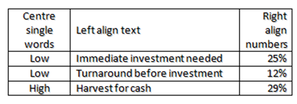
TABLE CHARTS
Try to find a better way to display your data than a table
Use tables for backup charts or pre-reading because they are very dense ways to capture information – dense tables are impossible to present however
In general in tables:
DOT POINT CHARTS
- Limit to 5 points
- Try to use structure/layout to communicate some of the message
- Never do a random list – there is always a way to make the order Make logical (e.g. order of importance or chronological – can illustrate this with an arrow)
- Make the bullet points consistent – e.g. all starting with a verb
- Dont have two dot point charts in a row in a presentation – you will put your audience to sleep
- Shorten the text to a few words, don’t write long sentences if you are presenting the page verbally; if you have to have a second point in the same dot point, use a ; not a .
PRESENTING NUMBERS TIPS
- Always show units (e.g. $m)
- Always round up numbers – write $6m not $5934561
- Make it visually easy to find key numbers – use colour, font size or box to highlight
- Provide summary numbers – e.g. on a multi-year graph, always show CAGR % (Composite Annual Growth Rate)
- Use indexes rather than double graphs to compare two sets on numbers on the same timeline
- Picking your start date – do you want to be honest, or pick your start date to exaggerate your point?
- Truncated Y axis – again, do you want to be honest, or truncated the axis to increase the visual impact?
COLOUR/FONT TIPS
- Consistency – in fonts, sizes and capitalisation (Either Caps First Letter or no caps first letter)
- General principle: Use colour to enhance the message of the chart, not just for aesthetics
- Capitalise for IMPACT, not BECAUSE YOU FORGOT TO TURN OFF CAPS LOCK
- “Find the banana”: Human eyes have evolved to spot ripe fruit in a forest. On each chart, think, “where do I want my audience to look first” and make this point “the banana” – make your most important point red
- Emphasise with BOLD, use Italics for quotes/asides
- Don’t use hard to read
text effects - Avoid bright yellow – will give your audience a headache
- Don’t use black font on dark colours, white font on light colours
- Check that your chart will work if it is printed in black and white by using the B&W or Greyscale button in the PPT View menu
- Calibri and Arial fonts have the best visibility on screen
- Use font 36 for data light presentations; for dense data-driven presentations, use font 24; don’t go below Font 18 for visual presentations
